Effective Design Selection and Inspiration
Hello! I’m Shintani, the designer.
Each month, we want to compile a list of “beautiful, quality websites” that you may be interested in or want to use as a reference.
Take a look at great design sites for inspiration to help you select an effective design and create a web design.
As mobile-first will become increasingly important, we have excluded websites with good visual design but slow display speed.
Overseas Web Site Design
1. Humen
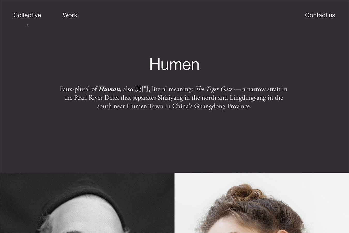
Bold use of simple menus and images for visual impact and layout Website design that is. Talented product design, branding, art direction, illustration, We do set design, photography, videography, and copywriting in multiple languages to capture human emotions. A group of creatives who design. They express that beautifully on their site.
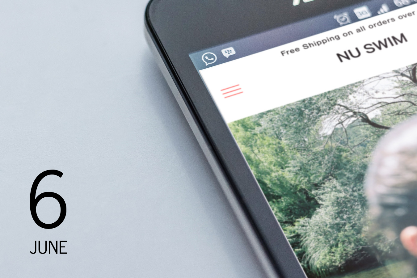
2. NU SWIM
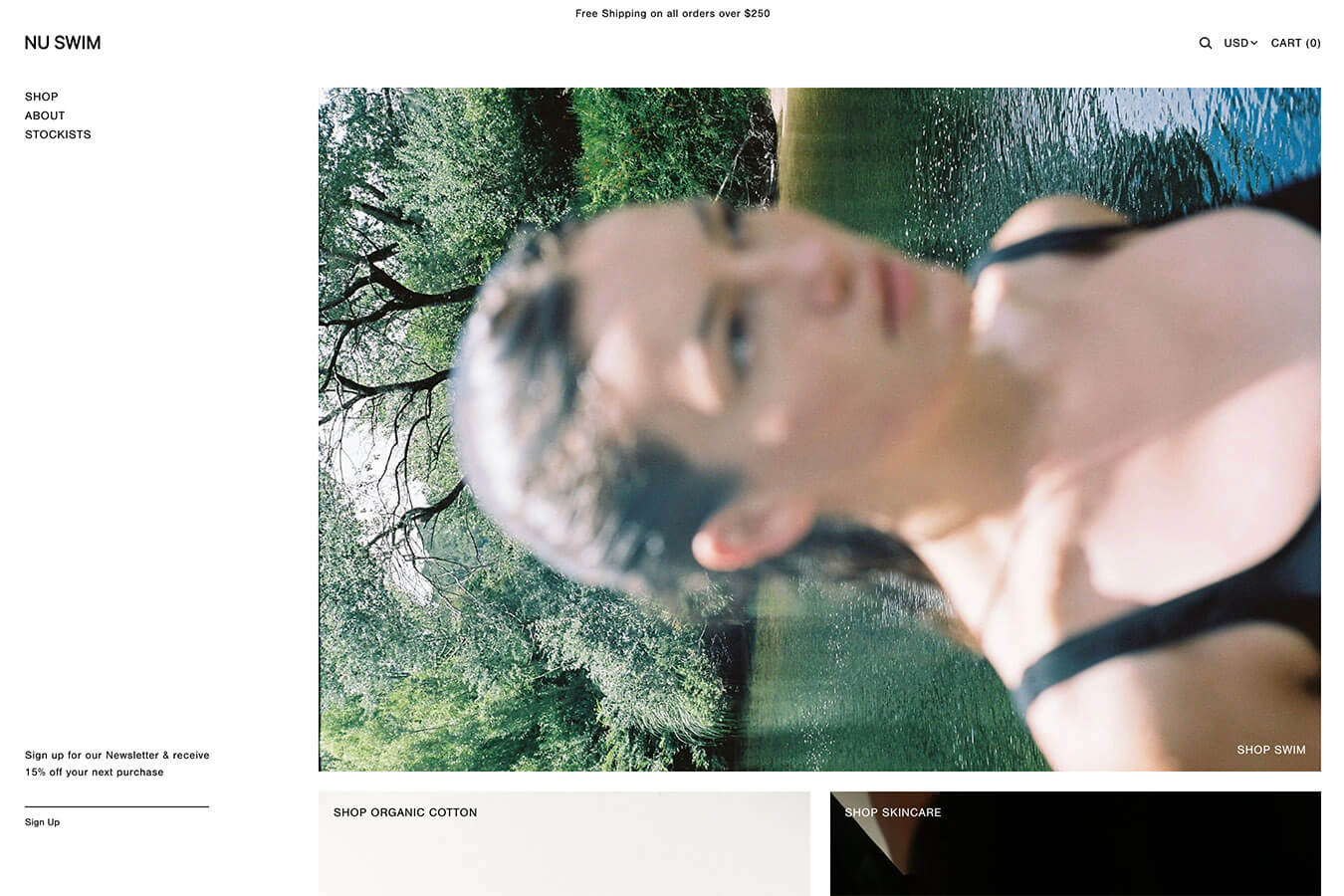
We are particular about the visual presentation of the products in a minimalist design. It is very different from other shopping sites in Japan, and we are trying to make the brand image and sales part of the site compatible with each other. The design capabilities of the company are amazing.
It is a New York-based brand and shop site that focuses on swimwear and lifestyle with an emphasis on fit, construction, materials and simplicity.
3. I&CO
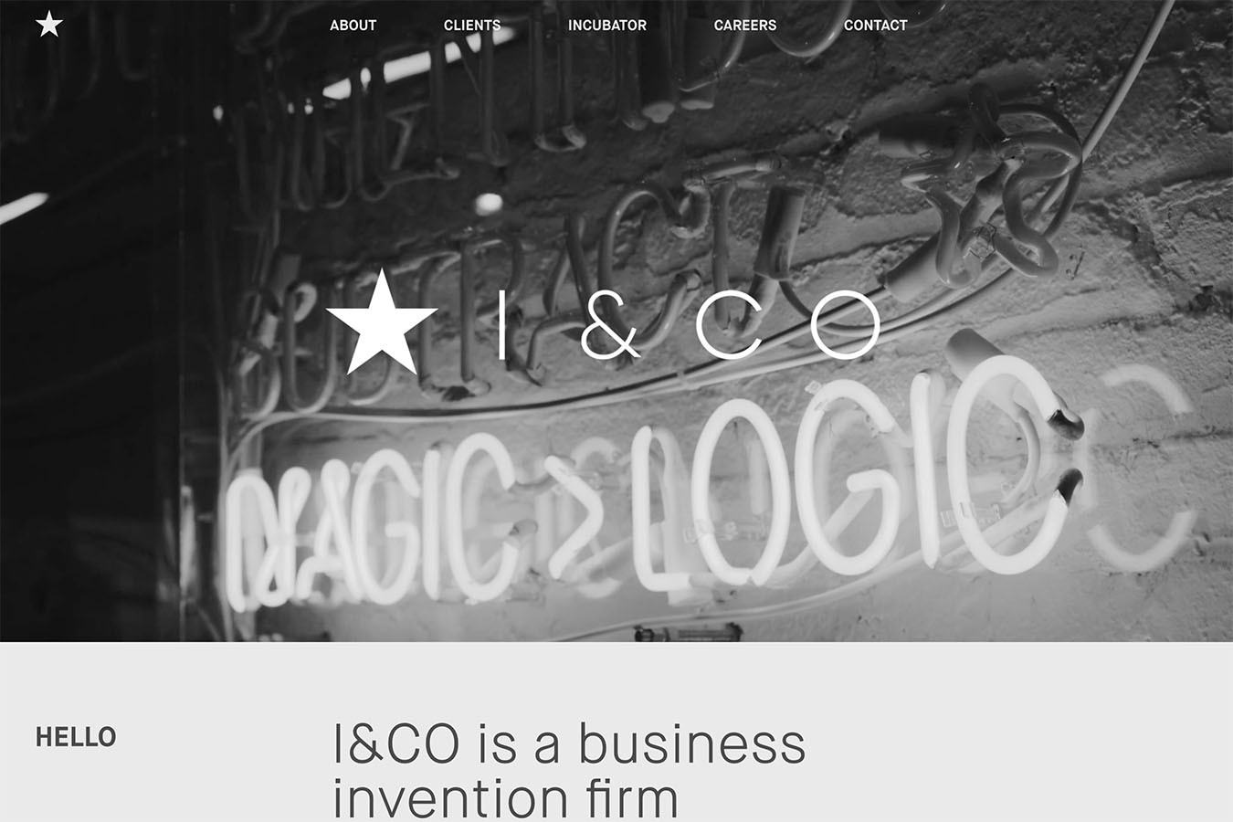
The layout structure is designed to keep the number of colors to a minimum, and to convey the main points in a clear and simple two-column layout. It’s excellent. It’s also very user-friendly when the menu is on mobile. Led by Mr. Ray Inamoto, who has been called the “Ichiro of the advertising world,” the company is a creative x business firm. The website of I&CO, a business-invention firm that embodies the future.
4. Locomotive — Montreal Web Agency
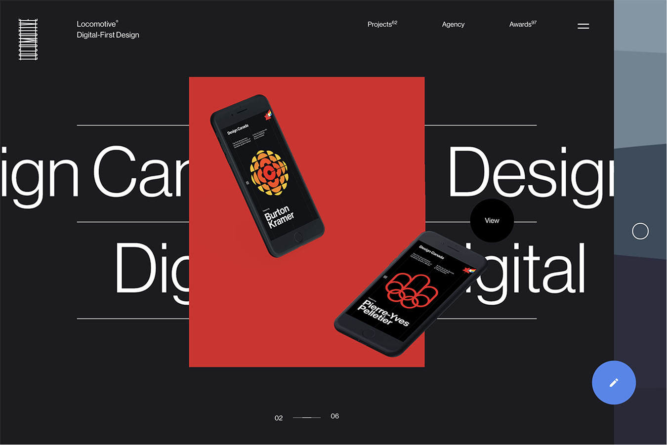
As you can see when you visit the site, various animation techniques are used. The line bouncing specs and the mouse-over effect is something I haven’t seen on many other sites. The effect is applied.
To my surprise, when I tried to copy the text with command+c, I saw a big “C” on the screen. It’s drawn. It’s playful. This kind of site tends to be very heavy, but it is not so heavy, and the stress is small. This is an excellent site.
5. Christopher Doyle & Co.
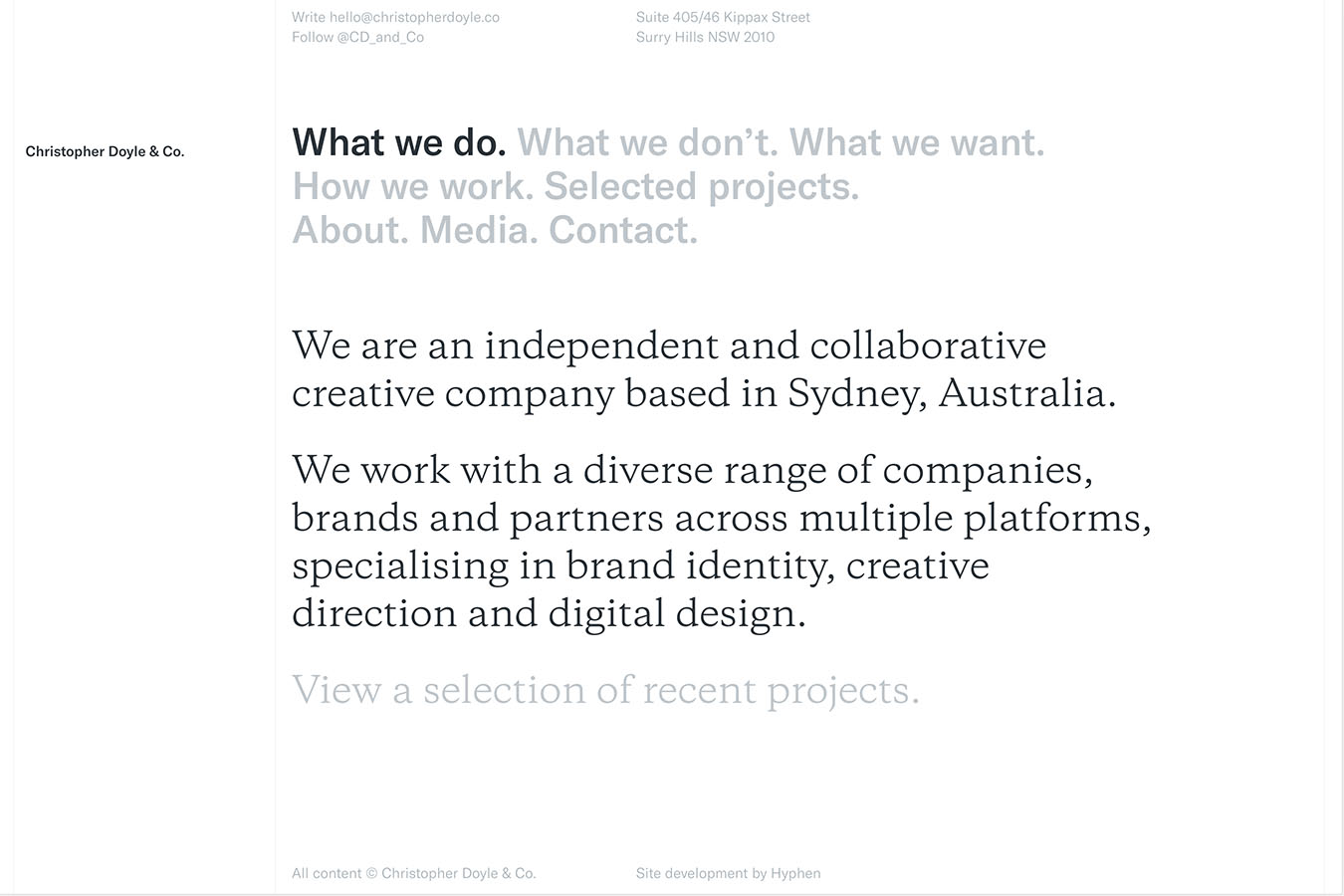
This is the epitome of a simple, minimalist website. Selecting the menu will bring up its detailed text body.
It consists almost entirely of text, but the layout structure and the way the content is presented without being boring is interesting. The way the gifs in the project introduction are shown is good, but that part of the page is a bit heavy, and the rest of the page is lighter than the It felt extra heavy.
→ https://christopherdoyle.co/
Website design in Japan
6. Shimokita Line Street
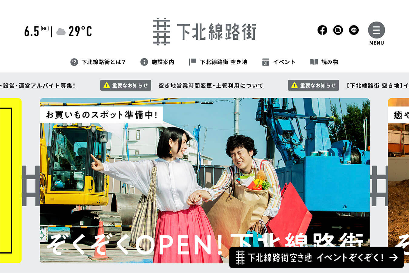
The contents and menu are laid out in a large format, and although it tends to be a pop-up site with a lot of information on the whole, it is focused on the main points and organized neatly.
The theme of the Shimokitazawa railroad district, which is undergoing redevelopment, is presented in a fun and easy to understand way.
7. Hikaru Utada Distribution Single “Time” Lyrics Site
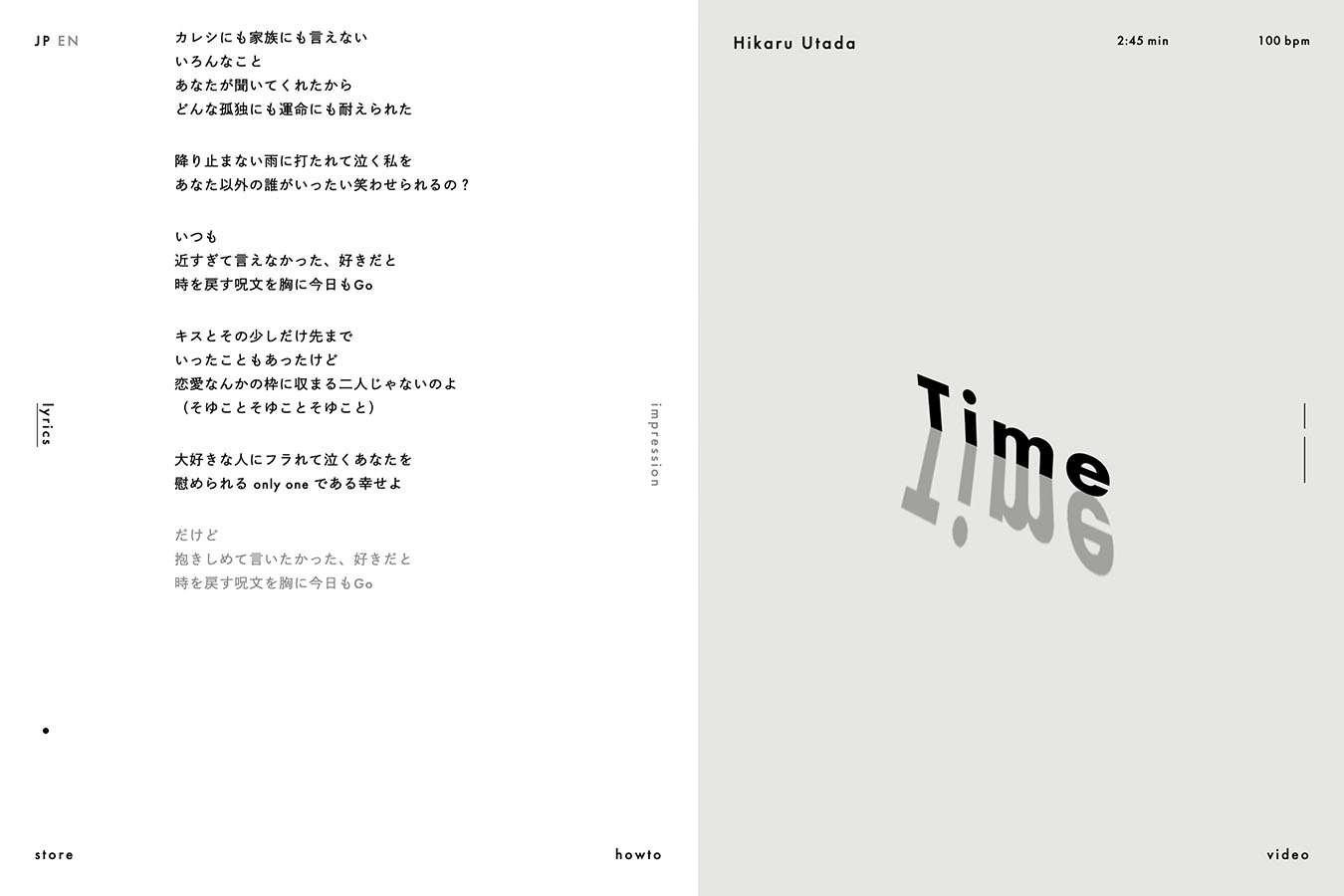
This campaign site focuses on the lyrics of Hikaru Utada’s “Time”. Scroll to reveal the lyrics, and click on the lyrics to tweet the portion of the song! The trick is in place.
Also, the posts from various people will be visible and connected. It is. It’s an interesting idea. The site is very simple and beautiful.
→ https://www.utadahikaru.jp/time/
8. group_inou / MAP
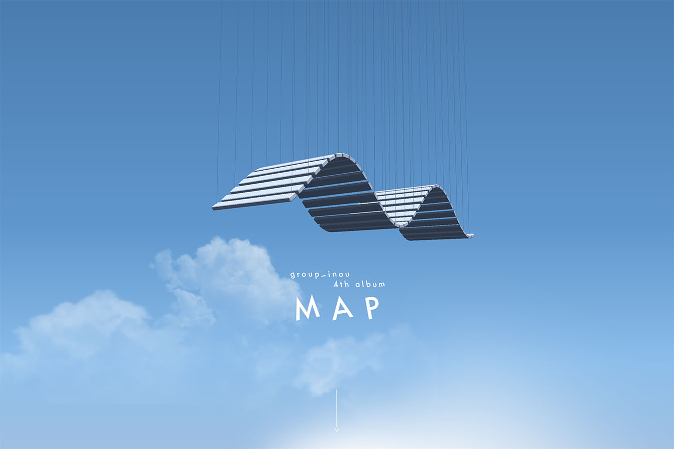
This site was actually created 5 years ago, but the animation of the catches is great, and the overall design of the site and the artwork are both great.
At the time, it was featured in a music video by Group Inou and at the Agency for Cultural Affairs Media Arts Festival. I feel the importance of “grasping”.
→ http://g-a-l.jp/group_inou/map/
Summary
What did you think?
There were a few more overseas sites this time, but I think there are many more overseas sites with designs that don’t stick to the theories. It is. I’m very interested in the trends, both at home and abroad, and it’s a good reference.
That’s all for Shintani!
I’ll be back in Part 2 with some more site recommendations!
We take orders for “simple and beautiful sites” from 100,000 JPY
We will propose a plan that is easy to understand and suitable for your purpose. Why don’t you have your own website with our most popular 100,000 yen package plan?
→ Learn more about website development.
Contact
We can design your website! Please feel free to contact us for more information.