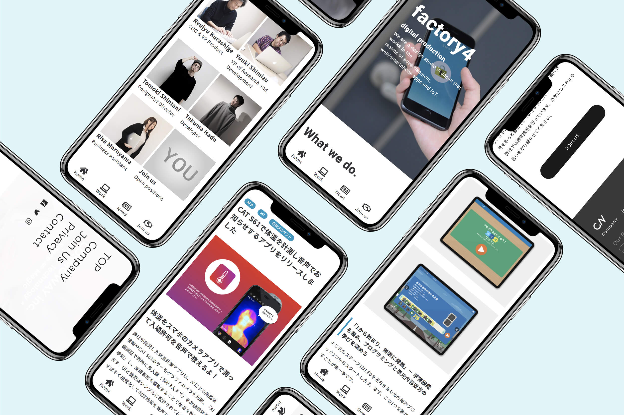
Hello! This is Designer Shintani.
As the importance of mobile first in websites continues to accelerate, I’d like to introduce you to a gallery site that can be used as a reference for smartphone sites and app responsive design.
目次
A collection of gallery sites for smartphone and responsive design and UI reference
1. sps collection
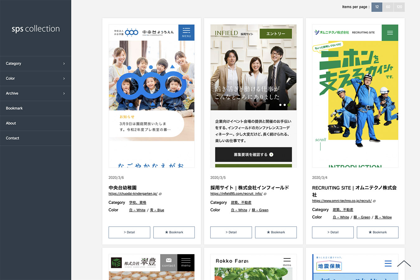
This is a collection of simple, easy-to-read links to smartphone site designs.
The site is categorized by category and color, and you can also search for keywords. In addition, it has a bookmark function that allows you to save your favorite design websites. Very convenient.
2.Responsive Web Design JP
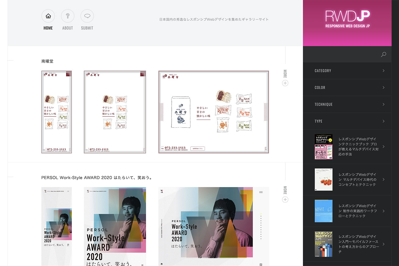
This is a gallery site with a collection of excellent responsive web designs specialized for sites in Japan.
The site is categorized into four categories: category, color, technology, and type, and you can also search for keywords.
3.Web Design Clip [S]
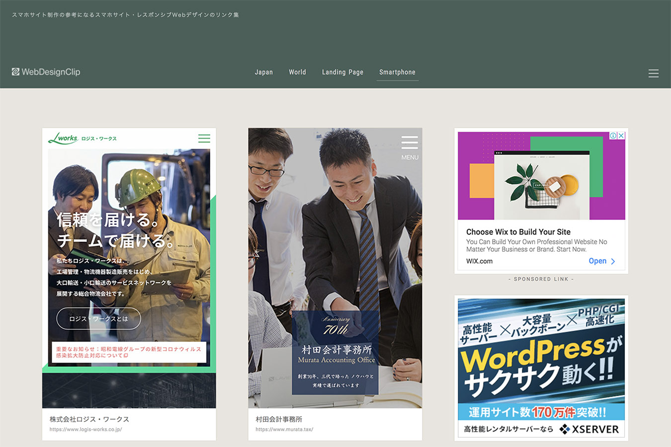
You can view web designs in four categories: Japanese, International, Landing Pages, and Smartphone Sites (Responsive).
The gallery site itself is simple and excellently structured, and the display is large and easy to read.
→ https://sp.webdesignclip.com/
4.AGT smartphone design gallery
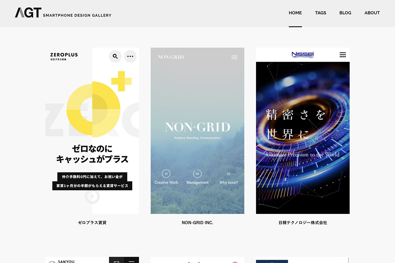
This is a gallery site that collects high quality websites for smartphones from around the world.
A feature of this site is that when you mouse over, a long vertical capture scrolls down to the footer.
→ http://agtsmartphonedesign.com/
5.iPhone Design Box
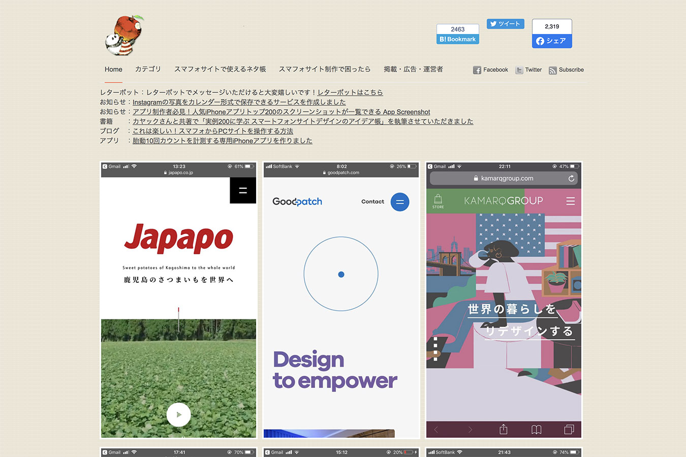
This is a collection of design galleries of mainly domestic smartphone sites.
You can check the TOP page of smartphone and PC at the same time on the detail page.
6.MediaQueries
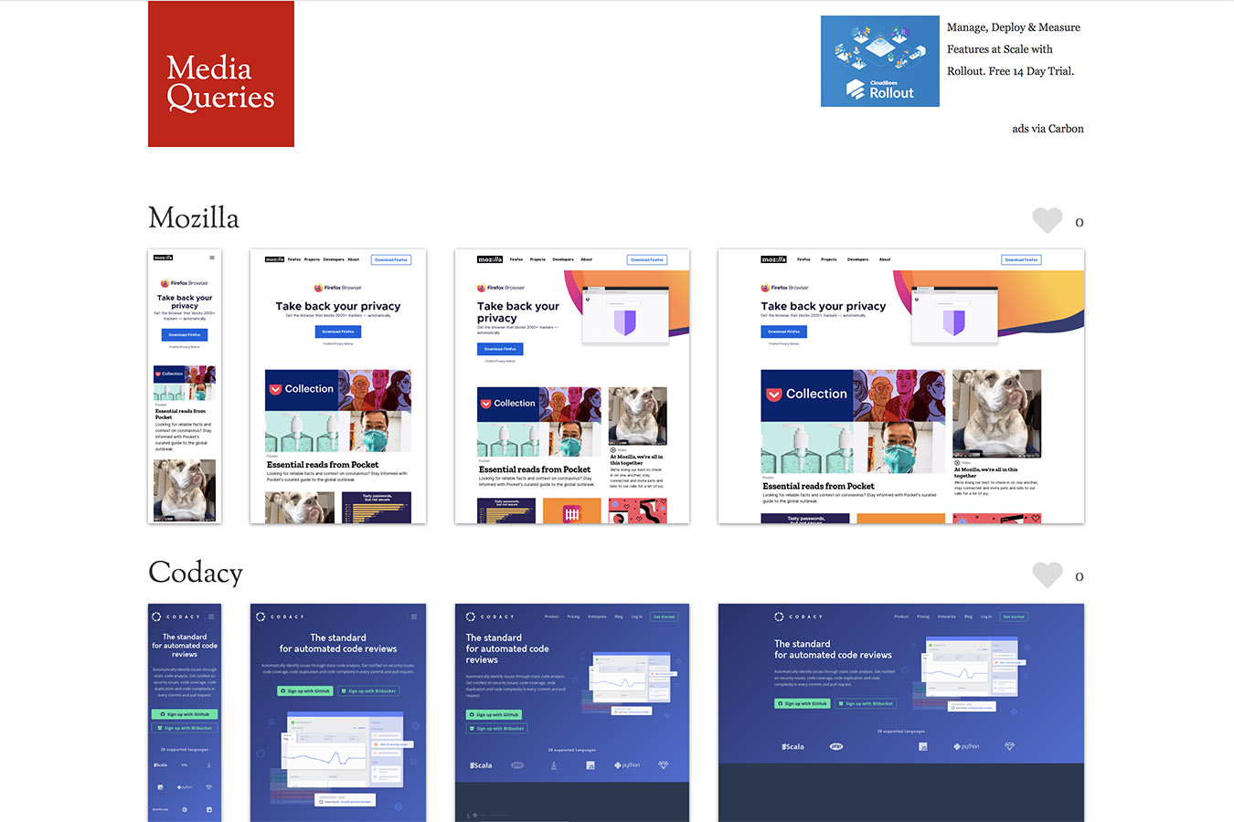
This is a well-established international site, and you can see the changes in four different screen widths.
The number of sites registered is huge and there is a lot of information, so I feel that I would be happy if there was detailed filtering.
A collection of app screen UI design gallery sites
7.Mobbin
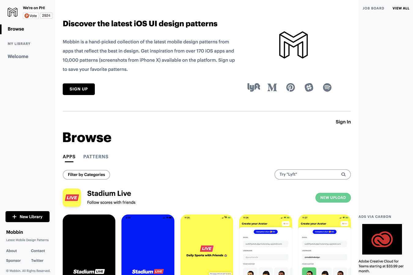
This is a site where you can browse the best designs of apps by category, pattern or element.
There are a lot of screenshots for a single app, and you can view the Business, the You can filter images by many genres, such as Entertainment and more. The Mobbin site itself is very easy to read.
8.UI Sources
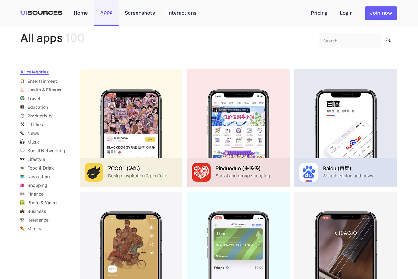
You can see a video of the screen movement during the operation of the app as well as screenshots of the actual app. You can. This is the part of the site that sets it apart from other gallery sites, and I find it lovely!
Of course, there are plenty of screenshots, and the UI Sources site itself is simple and easy to read here as well.
→ https://www.uisources.com/home
Summary
Google will fully migrate all websites to a mobile-first index by September 2020
What did you think?
Google’s announcement will begin migrating all sites to a mobile-first index in September 2020. It has been announced in advance that
We are still seeing some domestic sites that are only PC sites or not yet well optimized for responsive for smartphone sites.
In the future, there will be a need for sites with excellent UI/UX that do not have a negative impact on search results and SEO, and that are specific to smartphones.
Now that mobile phones have become the mainstream, I would like to keep a wide range of designs and UI in mind to design sites that are easy for users to use.
See you soon, it was Shintani!
Contact
We’ll take care of your app and smartphone website design! Please feel free to contact us for more information.