Logo Design Techniques!
Hi, I’m Designer Shintani.
We do a lot of app development and IoT projects, but we sometimes get jobs to create a logo.
Coming from a design background in the printing industry, logo creation is fun and challenging for me.
When I see a logo I created on the street, I feel very happy.
In this article, I’d like to introduce a few techniques for logo design in Illustrator that even novice designers can use right away.
What is a “logo” anyway?
Logos are essential for shops, websites, signage and business cards. As brand recognition and eye catching, it has an important role in advertising and public relations. But what does a “logo” mean in the first place?
In fact, the word “logo” means “word” in English. From there, we came up with the words “logotype” (word) + type (type) = “logotype” made from type, and “logotype + Mark = derived as a pictorial “logo”.
Our focus this time is on the design of the “logotype
A typeface may be drawn from scratch, depending on the image or request, or it may be created by successfully modifying an existing font.
‘Just typing a common font in solid form?’ Even if the logo is simple, it is actually a balancing act between letters, width, height, position and size. In fact, there is a lot of depth to logo design. Logo design is actually very deep.
①Just a few tweaks to an existing font! Create a soft logo.
Logos displayed on the web and on smartphones are often created using simple, highly visible fonts.
However, if you’re worried that using a simple, existing font will make it look too common, or if you don’t have a font that seems to fit your image, you can try creating your own using an existing font.
Let’s take a look at the steps involved.
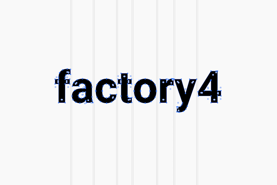
First, choose a font in Illustrator, enter the original text, then go to Format > Create Outline (shortcut Command + Shift + O is useful) to take an outline.
Taking an outline allows you to turn the outline of the text into a path, and you can touch the anchor points and handles of that path to change its shape.
Some fonts have an uneven balance between characters as you type the text . In this case, I adjusted the spacing between the letters to make them even and balanced.
フォントの角に丸みをつける
When the entire object is selected with the Direct Selection Tool (A), the ◉ symbol appears at each corner and the Click and drag the ◉ symbol. Click and drag the ◉ symbol in any of them, or click and drag the Corner You can change the roundness of the corners by changing the ◉ symbol in the Direct Selection Tool and by clicking and dragging again to change only the selected ◉ symbol.
You can also change the selected ◉ mark by clicking and dragging again on the ◉ mark to make the corners rounded after the ◉ mark is displayed in the Direct Selection Tool.
You can also round the corners by choosing Effect > Stabilize > Round Corners
Simply adjust the spacing between the letters and round the corners in this way to create a balanced and soft-looking logo.
![]()
②Shape your text with envelopes and create dynamic logos!
The envelope is a feature that allows you to combine and transform selected objects.
Let’s apply an envelope to text. Because the text itself becomes a shape, it can change the impression from the original font significantly.
①As with the first step, choose a font in Illustrator and enter the original text.
In the case of the envelope, you don’t need to outline it as I did earlier.
Create a shape to get the desired shape
Using the rectangular and elliptical tools, I used the rectangular tool and the elliptical tool to create a simple shape that I just cut out in Pathfinder. Create it. Here I created a shape that looks like the title of a famous RPG game.
Move the shape you created to a level above the text (even if it’s separated by layers), and then add it to the text and Select two shapes at the same time. Then select [Object], [Envelope], [Create with foremost object] ( (Command+Shift+O) to apply the envelope and you’re done. I think the text has been transformed along the shape.
If you click on [Object], [Envelope], and then [Expansion], the envelope is applied. An outline will be created in the text and you will be able to touch the path directly, just like in (1). This is useful when you want to make adjustments to one character at a time.
![]()
Summary
The logo I created using the above technique is being used in the city!
This is a logo for a dentist that was previously created by Shintani. I used the rounded corner effect introduced in 1).
What did you think?
A little bit of work can change the impression of your logo and the atmosphere you create. It’s fun to think about the various directions you can take by adding effects in Illustrator! Hey.
This technique can be applied to a wide range of logos, including book covers and web titles, so try it out.
This logo is awesome! or using a technique to create such a good logo! If this is the case, please let me know.
That’s all for Shintani!
Contact
We can design your logo and website! Please feel free to contact us for more information.