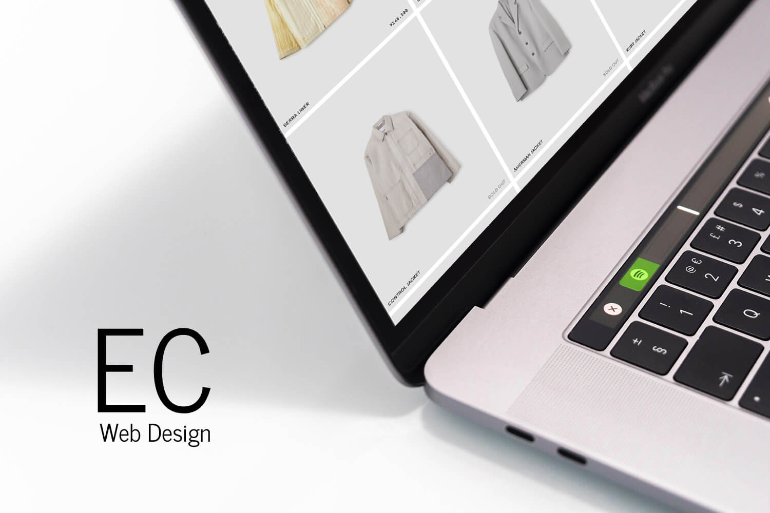
目次
The importance of online stores is growing.
Hello! I’m Shintani, the designer.
I would like to compile a list of “quality overseas e-commerce sites” that I am interested in and would like to refer to.
In the situation of the spread of the coronavirus infection, the importance of online shops has been in focus. We have received an increasing number of inquiries about creating an e-commerce site.
So, for those who are looking to revamp their e-commerce site, or those who want to start an e-commerce site, “design” is an important factor.
Take a look at great design sites for inspiration to help you select an effective design and create a web design.
Design of an overseas apparel e-commerce site
1. LAUREN MANOOGIAN
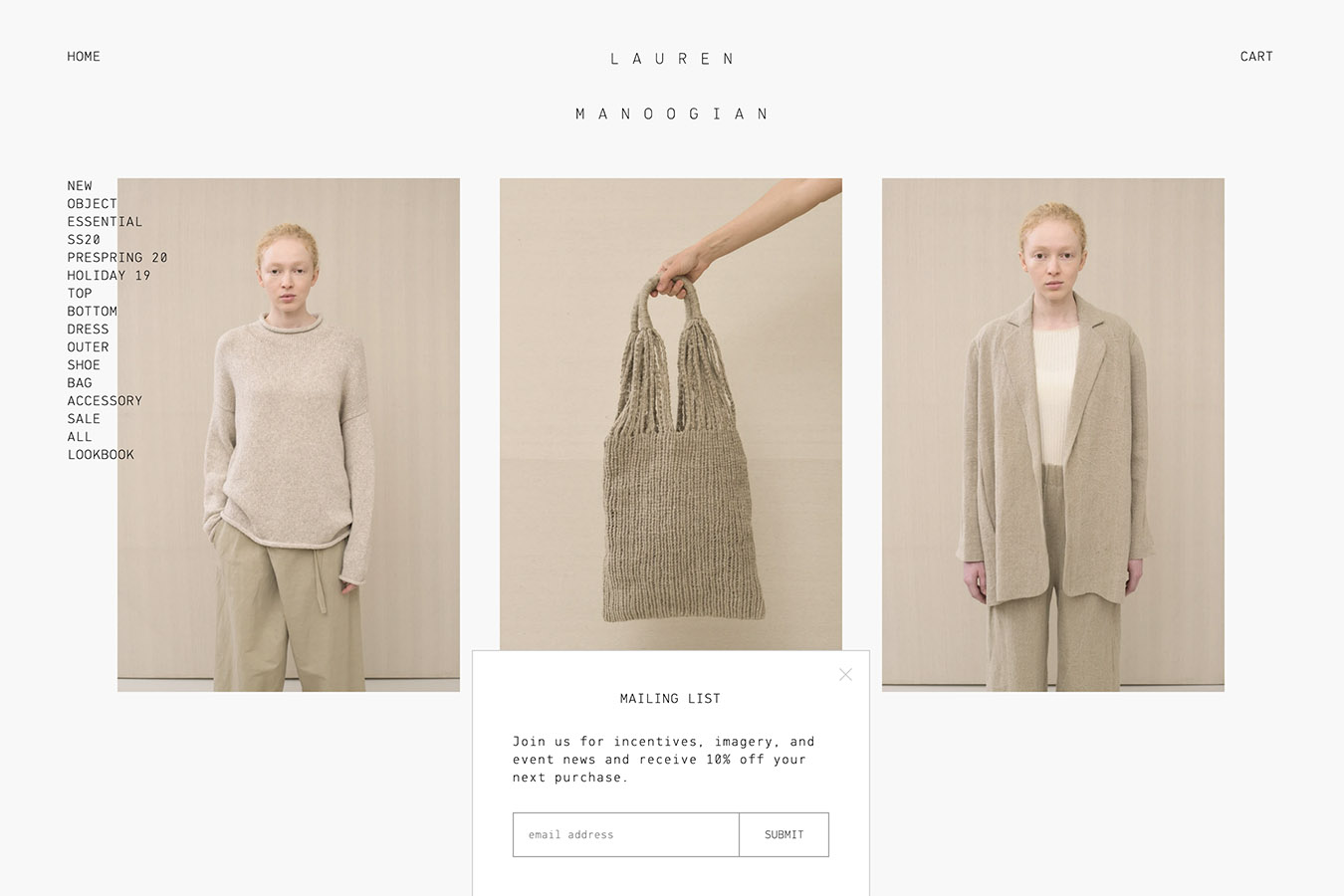
A simple and minimalist design that fits the brand image. The use of font weights and the way they are superimposed on the product images have been carefully calculated. I can see why.
Other than the product pages, some of the pages are consistently very simple and text-only, but they adequately represent the world.
→ https://laurenmanoogian.com/
2. OAMC
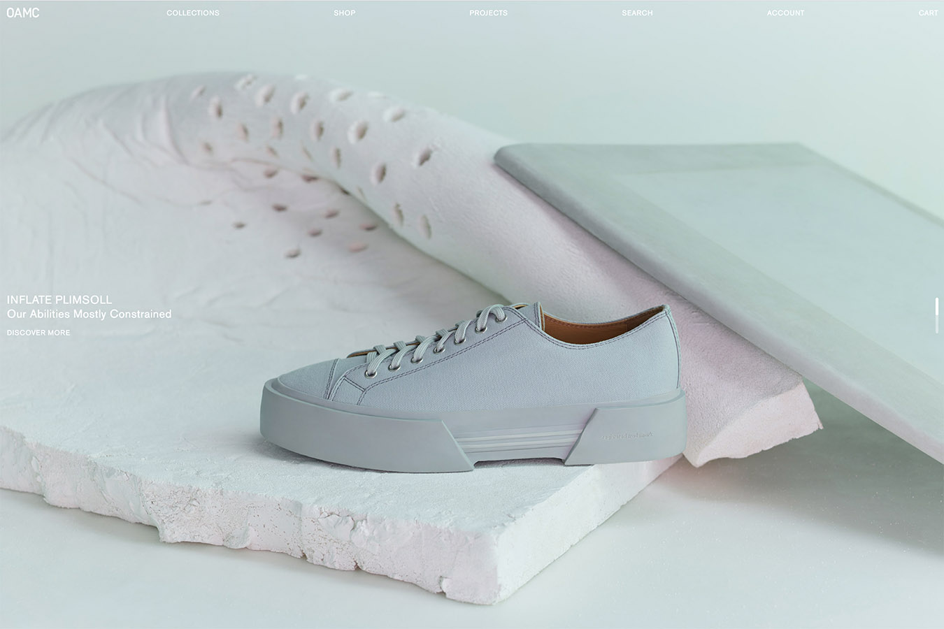
You can tell from the first view that your taste is lovely, justify, left and right full of it. The expansive main menu notation and the lack of left and right margins on the product listings page are also excellent.
The product detail page is very impressive and effective with a large single column of images aligned in the center.
3. Études Studio
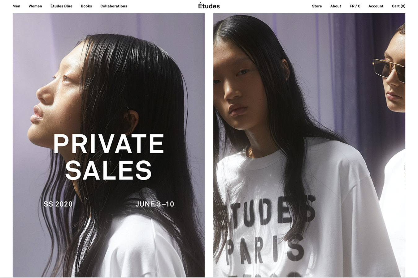
Bold use of images and videos for visual impact and layout Design. The product list page is interesting, with a randomized layout that eliminates the regularity.
The effect of hovering over the menu is not done in a special way, but it matches the site image strangely.
→ https://www.etudes-studio.com/
4. Building Block
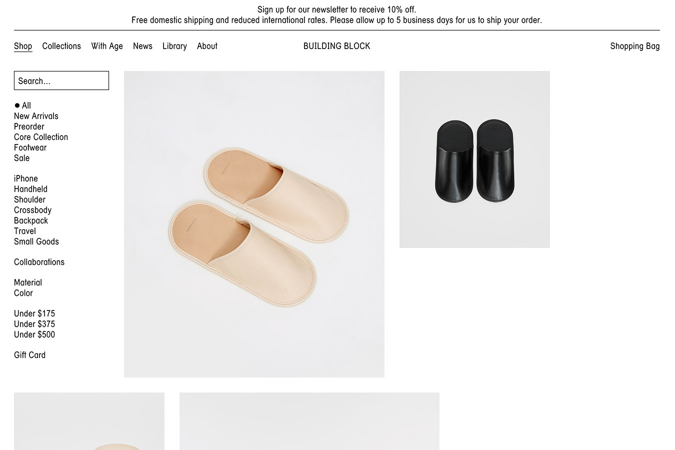
It’s simple and the font is very impressive. The use of fonts, whitespace, and image placement accurately conveys the brand image.
The site is not using any special difficult effects, and we liked the quick and light transition. I think this is one of the rare EC site designs in Japan.
→ https://building–block.com/shop
5. NU SWIM
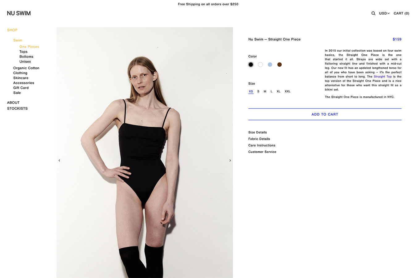
We are particular about the visual presentation of the products in a minimalist design.
It is very different from other shopping sites in Japan, and we are trying to make the brand image and sales part of the site compatible with each other. The design of the website is excellent. The vertical product pages, small fonts, and button design are all excellent. It is.
6. KLOKE

The first view menu selection is an impressive design. The full screen images switch comfortably from one category to another by mouseover.
The product pages are simple and nicely organized, and the product detail page has a large row of images. It is displayed. I think this type is more common overseas.
7. Totokaelo
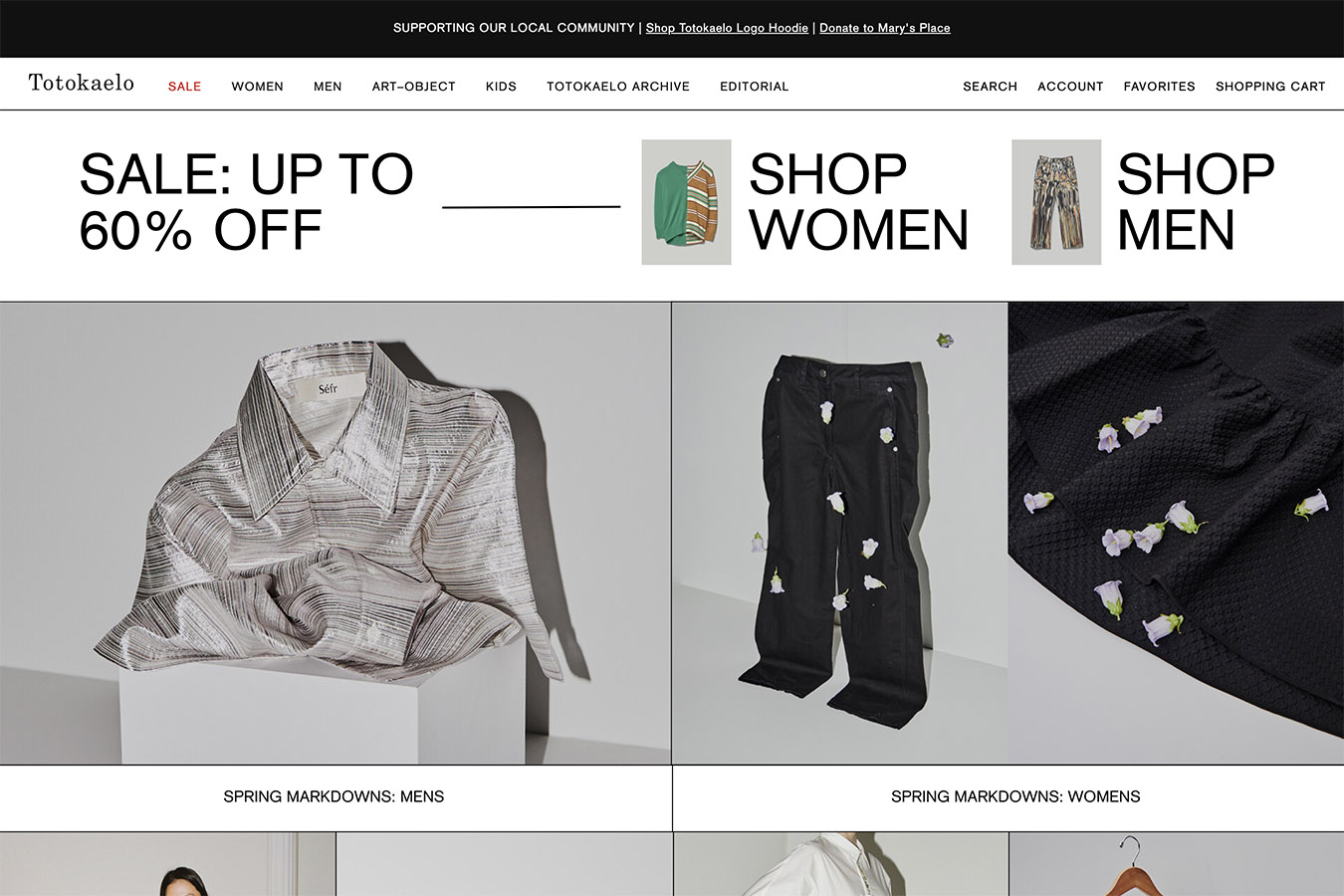
The layout of the first view, the larger font that directs you to the sale, etc. is impressive. The design features black lines around the points of contact between images and content. I don’t think this is a design that is often seen on Japanese e-commerce sites.
8. Maryam Nassir Zadeh
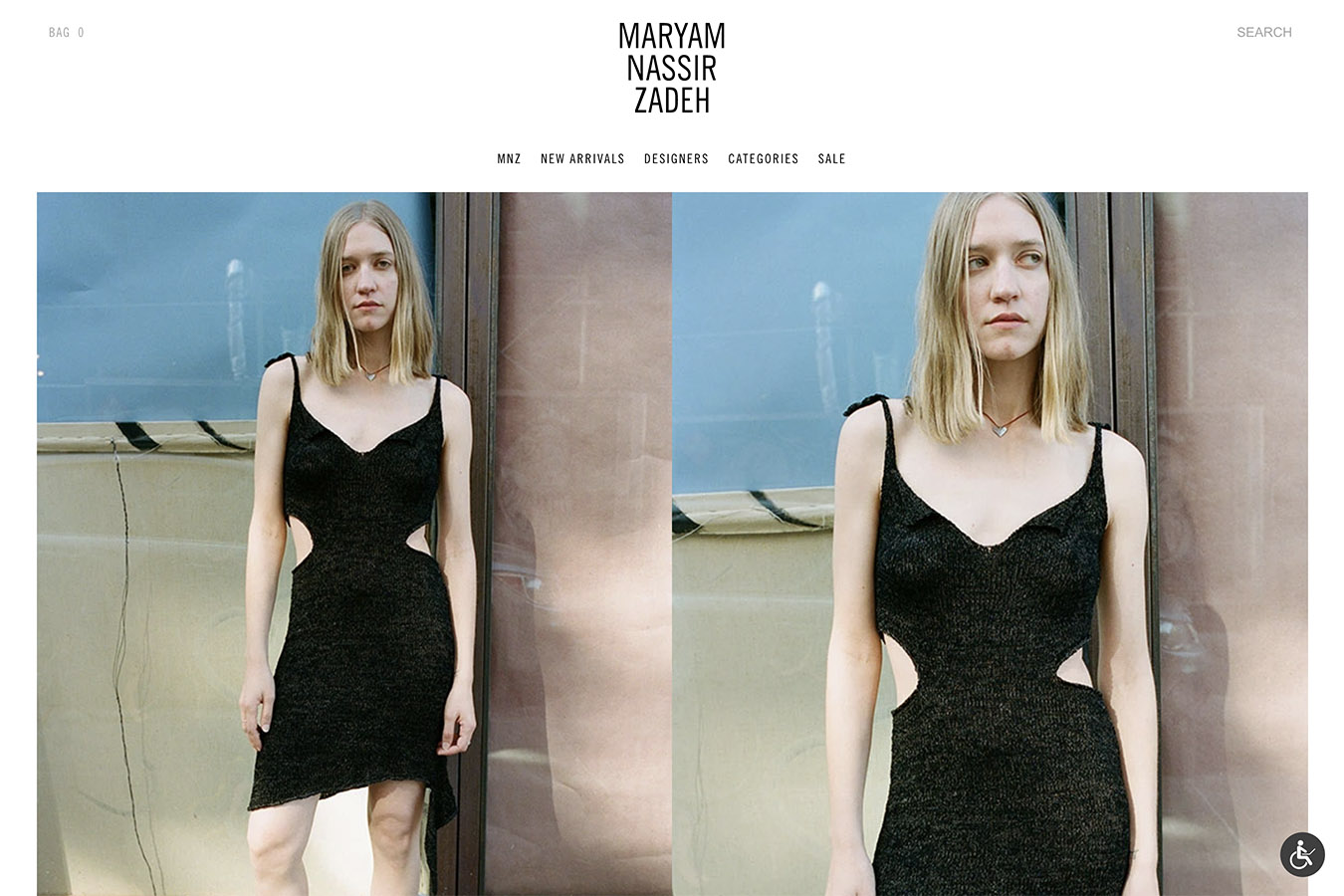
This one is also basically simple in its overall design. The features include the way the product listings are presented and the way the images of the product details are presented, making the visuals bigger and bolder. It is laid out, and the photos are a joy to look at and very eye-catching.
9. Stand Up Comedy
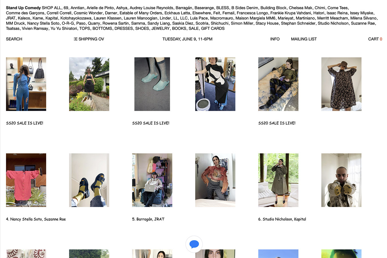
This one is an extravaganza, or rather, a design that surprised me, so here it is.
The design theories were completely ignored in the structure, and the layout, with the menu stuffed into the header I suspected it wasn’t loaded with CSS…lol. I’ve got a balloon effect that pops up when you click on an image, and handwritten text on the product detail page. When I looked at it, I was impressed that maybe the design could be more free.
→ https://www.standupcomedytoo.com/
Click here to see the domestic e-commerce sites we have designed
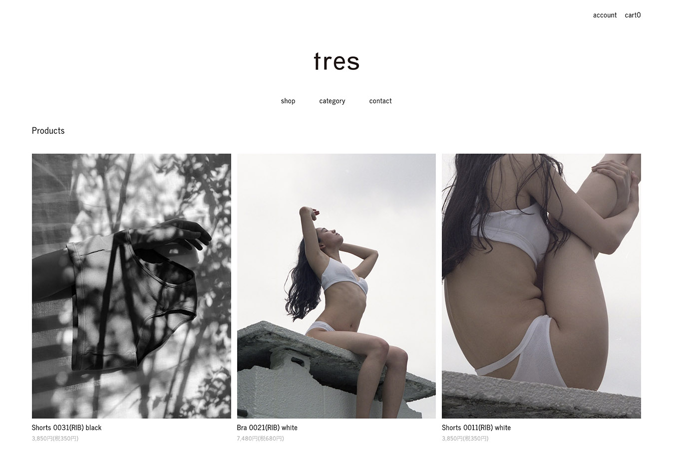
This is a domestic website design I designed for an online shop in Japan.
The client wanted a simple, easy to view, large visual design that would convey their brand image while still being visually appealing.
tres tokyo
N id/n id a deux
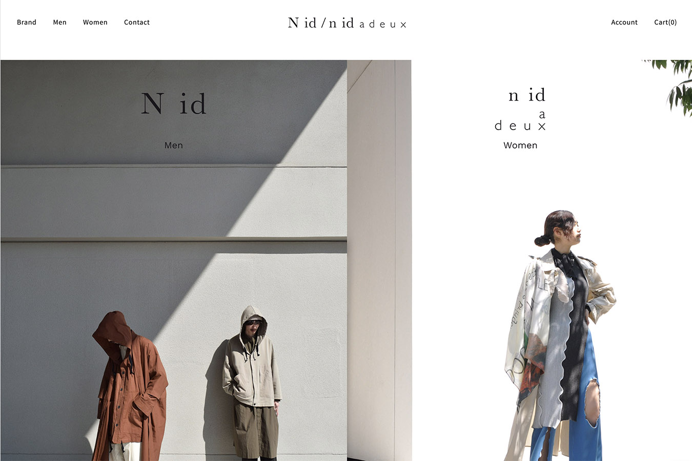
→ https://store.nid-tokyo.com/
Summary
What did you think?
In this issue, we have introduced the overseas EC sites.
In Japan, you can easily start an online shop with “Color Me”, “BASE”, “STORES”, etc. There are many services that can be used. Anybody can easily have an online shop by using one of these templates, but It’s not possible to create a design that is similar or differentiated from others, or that pays attention to detail.
In the midst of all this, overseas sites have been pushing their brand image strongly, not being confined to theories. I felt like there was a lot of design. It is very helpful in that area.
With the growing importance of e-commerce sites, I’m very curious to see how the trends and services will develop in the future, both domestically and internationally.
That’s all for Shintani!
We can create your EC site.
We will provide you with a plan that meets your objectives and is easy to understand. Why don’t you have your own unique online shop?
→ Learn more about website development.
Contact
We can design your website! Please feel free to contact us for more information.