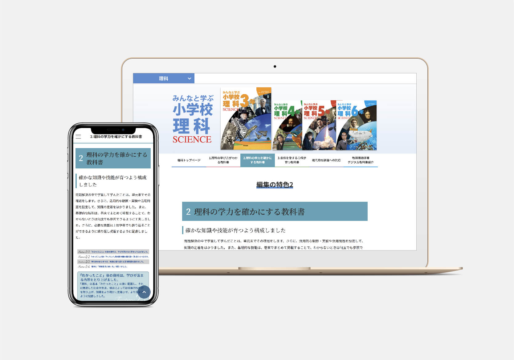
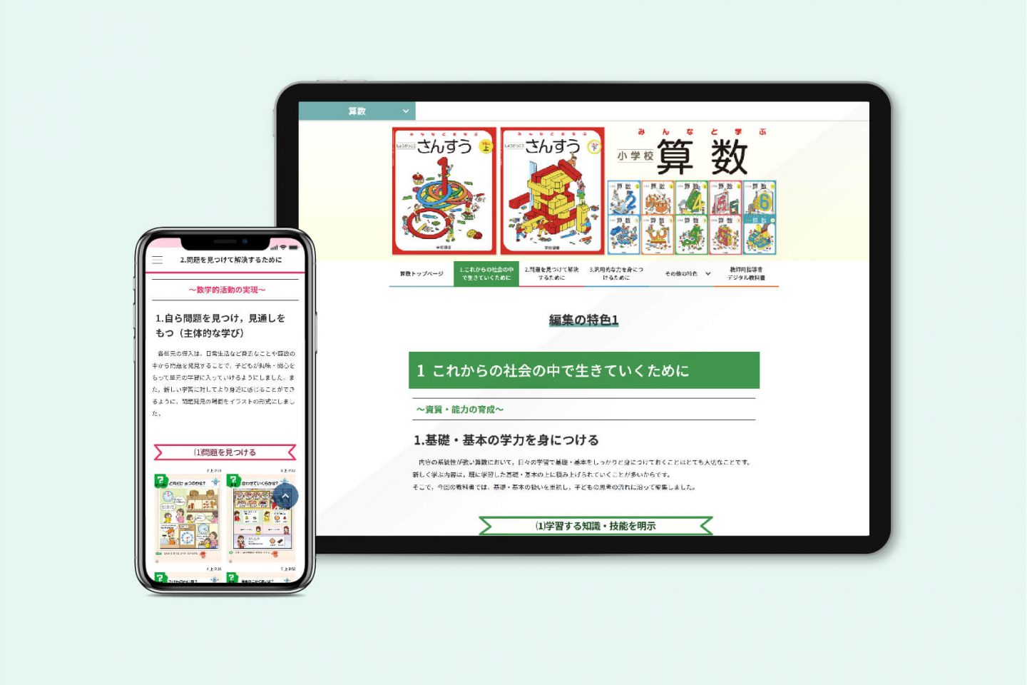
The paper pamphlet introducing elementary school textbooks for the 2020 school year is made available on our website. The textbooks and other elementary school materials that we have all come to know and love were originally developed by various textbook companies. The textbooks and other elementary school textbooks that we are all familiar with were originally developed by textbook companies. It is produced and then adopted by each school and local government for use.
The creation of a website for this pamphlet is an example of how the process of getting educational materials into the hands of children has changed.
We have been working on a wide range of website development, renewal, operation and renewal of websites for some time. We have been flexible. At times, we can create materials in response to requests, or we can even go to the site to take photographs.
We think one of our strengths is that we can provide total support from zero to the completion of the project.
This was a new attempt to turn paper brochures into a website.
Paper pamphlets are widely used in a wide range of fields, from corporate introductions to product introductions. It’s an employed medium. It’s a familiar one in our lives.
Why websiteification now?
What do you do when you think “I want this detailed information” or “I want to know this” now? Isn’t it? A lot of people don’t just open up a search site on their own smartphone and type in a keyword to find Isn’t it?
I believe that you are getting the same kind of information you need at work through your computer. As you can see, nowadays, using digital devices to get information in our daily life has become very popular. became.
Nowadays, the education industry is at a turning point of digitalization. While digital textbooks and programming education are being promoted, brochures introducing educational materials are also being published on the website The need for this is increasing.
This is because, as mentioned above, the use of digital devices has accelerated, and because they are located in open areas on the Web, they can be carried and distributed with less effort, and they can be expected to be actively accessed by a larger number of people at any time and in any place.
As a result, this can be a more effective means of appealing to schools for the selection of textbooks from textbook companies.
What you can and can’t do on the web, from the differences in design between paper and
It might sound easy to say “from paper to website”, but it’s not Nope. However, the font of the text, the size of the images, and the transitions and layout of the web. Many limitations come into play.
On the other hand, the advantage is that you can put a video on it and there are no restrictions on page content or number of pages to develop effective content.
We started our consulting service by asking our client how they wanted to create a website based on their existing paper brochure.
This is where our designer’s previous experience in paper and print design came in handy. Based on what you can and cannot do with a website and the differences in design between paper and We’ll explore how to make it look even more effective while taking advantage of its advantages.
Of course, as we transitioned from paper to the web, we had to make sure that the content was not too much or too little, and that it would not be different from the original.
We also researched and researched the design and layout of other textbook companies’ websites.
Research is essential in any project to know what kind of content is needed and to differentiate the website from others.
Based on our findings, research and surveys, we created the “Guidelines for Replacing Paper with Websites”.
This guideline summarizes the restrictions on text, images, and layout, as well as proposals for website templates to help clients understand the characteristics of paper and websites.
The Importance of Direction in Production
Since each subject had its own department, it was a big challenge to create a unified sense of design for the web, based on the requests and images of each department.
In the beginning, we couldn’t coordinate the requests from each department, so we proposed to the client to work across the organization to unify the contact point.
Then, in order to show the unity of the company on the web, we carefully designed the company’s philosophy, colors, and future plan. Hearing. We also had the flexibility to adapt to a schedule that was difficult to adjust.
In the production process, we made every effort to structure the pamphlet in accordance with the proposed web-based template, and made every effort to simplify it for ease of reading and understanding.
In fact, the paper pamphlet data was created using InDesign, with a completely different approach to design and layout, as well as a completely different approach to each subject.
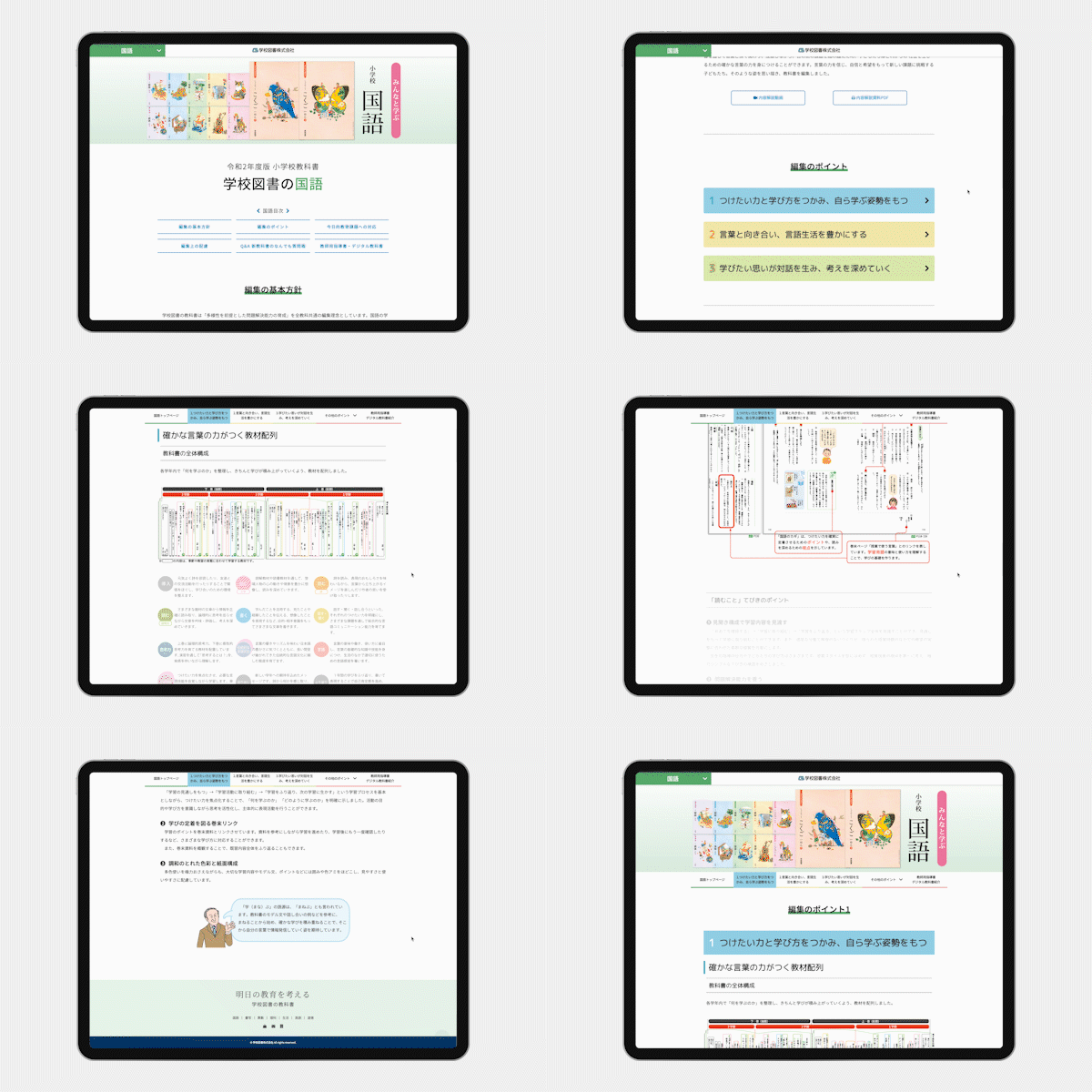
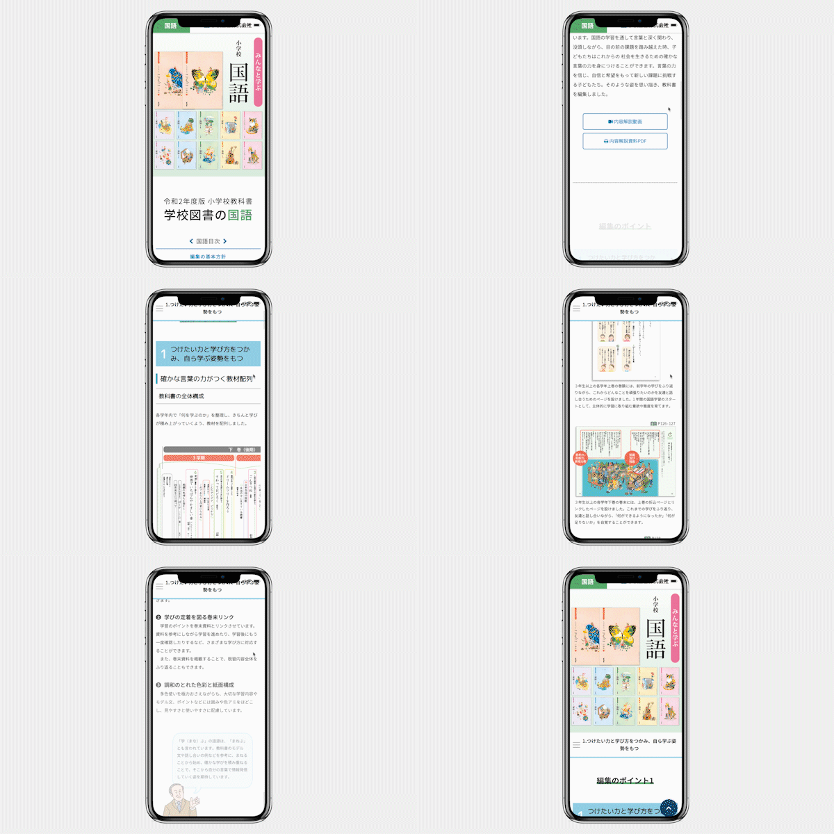
For example, Japanese language textbooks were originally written vertically, but the web is basically written horizontally, so we had to be creative in order to maintain the image.
Within a limited time frame, we were flexible enough to respond to requests for additional design and revisions, and we sometimes made suggestions based on our knowledge and experience during the production process.
By being involved in the production process from the direction of the project, we are able to stay one step ahead of the branding, efficiency and accuracy of the project.
We are always looking to maximize the value of our clients’ projects by moving in the same direction as them.
To build a website that is valuable to the users.
The key to a website is how well it catches the eye in one scroll.
For each page, we made sure that the table of contents of the textbook is focused and focused, and that images and photographs are used to catch the eye, so that the content can be read and understood clearly.
Our designers also created the buttons and images that were placed throughout the project. The materials used were also designed with a sense of unity and simplicity in mind, as well as a color universal design that takes diversity into account. (CUD).
Today, there are many adults and children who see colors differently from the general public. For a page that deals with elementary school materials, we took this diversity deeply into consideration when designing the site.
In addition to preparing the design and layout of the website itself in this way, it must also be designed for use by various digital devices such as computers, tablets and smartphones.
For this reason, the website is responsive and can be optimized for display on various devices, so that it can be viewed comfortably both vertically with a smartphone and on a tablet.
Furthermore, we aim to increase the speed of the website by reducing the weight of the images so that loading times can be compressed even under 4G communications.
Thus, the website for introducing educational materials for elementary school students was completed, which can be accessed from any device.
The website was designed to be used by a wide range of people, including sales representatives from textbook companies and teachers from schools and boards of education, and I believe that the website has high usability value.
In particular, I feel that the direction of the website was very important in order to accurately communicate what we wanted to convey in using the materials and what we emphasize in each subject area.

Be part of the future of the education industry.
We are hearing more and more about the use of one computer/tablet per student in the elementary school classroom.
With the increasing use of digital devices in the education industry, we feel that the use of the Internet and websites will continue to increase, not only for the introduction of educational materials for elementary school students.
We were able to play a role in this, and it was a great experience for us to convert our paper pamphlet to a website.
In this era, we can expect to see an increase in the need to convert paper brochures into websites in a wide range of fields, not only in the education industry.
We believe that it is impossible to create an effective website simply by transferring a paper design to a website, but we believe that it is possible to create a good website only through a process of knowledge, technology and direction backed by research.
We will continue to work closely with our clients and use our experience and technology to create websites that further enhance the value of information.
Contact
Please feel free to contact us if you have any questions or concerns.


